

1. What HANSENBERG Is
HANSENBERG is a major Danish educational institution offering vocational programs and technical upper-secondary education. The project was a full redesign of their website in Umbraco, bringing clarity, structure and a refreshed digital expression to a brand rooted in strict visual guidelines.
2. The Core Challenges
➀ Information overload
The previous site suffered from years of accumulated content without a proper content strategy:
Editors lacked space for secondary and tertiary information, forcing them to place practical details in structurally important areas.
Education pages used a tab-based layout that encouraged duplication because editors were afraid users would miss content.
The result: bloated pages, inconsistent layouts, and accessibility issues caused by scattered or buried information.
➁ Too many UI elements
To compensate for gaps in the system over time, the client had added many similar but slightly different content blocks. With too many components in circulation, the interface felt chaotic and difficult to maintain.
➂ A visual refresh within strict limits
HANSENBERG’s brand is defined by stringent guidelines. The challenge was to modernise and elevate their online expression without breaking the rules—finding a contemporary balance that would resonate with both young students and their parents.
3. My Role
As Lead Designer, I shaped the visual direction, UX concept, and key parts of the information architecture. My responsibility was to reinterpret their identity for the digital space while respecting an existing, rigid design guide—and to solve the deep structural UX issues that had accumulated over time.
I collaborated closely with Senior Advisor Carsten Nielsen at Limbo, who owned Information Architecture and Wireframing. I worked with the client, an intern (Mads Bang) during research, and the development team to deliver a system that was both modern and pragmatic for editors.
4. Approach
4a. Understanding the School Firsthand
Before designing, I visited the campus with my intern Mads Bang to gather insights and capture fresh photography. Talking to students helped us understand how they viewed their school. New on-location photography helped the client see their own facilities through a slightly different lens. By presenting familiar environments in a more considered and contemporary way, the imagery supported the exploration of a refreshed visual expression.


4b. Fixing Content Overload with a Structured FAQ Page
To relieve congestion on the education pages, we introduced a filterable FAQ section as a dedicated home for all secondary and special-case information. This solved multiple issues at once:
Education pages became leaner, clearer, and better at recruitment
Editors had a proper place for edge-case content
Users could find practical answers without navigating deep page hierarchies
It was a structural change that improved findability and reduced cognitive load across the entire site.

Not my work! Information Architecture and Sitemap by Carsten Nielsen Senior Advisor at Limbo.
Working together helped shape our UX solutions. It was especially helpful in mapping content structures which led us to designing a dedicated FAQ Page.

Some Wireframes for this project.


Left: FAQ Page with filters and tags.
4c. Refining the Visual Identity
Together with the client, we shaped a clear brief and introduced subtle but meaningful visual updates:
A new contemporary typeface to modernise the tone
A remixed version of their existing colour palette
A balance between youthful energy and professional credibility
This allowed the brand to feel renewed while remaining recognisably HANSENBERG.


4d. Simplifying the Interface with More Flexible Elements
Instead of offering many context specific blocks, we created fewer with more layout variants. This empowered editors to build clean, consistent layouts without the chaos of dozens of competing elements.
4e. Designing Rapidly and Precisely with Custom Design Token Boilerplate
For projects like HANSENBERG, I work from a reusable design-token boilerplate that lets me spin up a full variable system in minutes. The template generates Figma Variables for typography, color, spacing and radii — all mapped back to a token structure in Token Studio. This keeps design and development perfectly aligned and ensures that every stylistic decision exists in one consistent system.
Because fluid type wasn’t practical in Figma at the time, I used Variable Modes to represent the exact screen widths we were designing for. This approach let me build responsive text styles without hacks: when a component is placed into a mobile, tablet, or desktop frame, its typography adapts automatically based on the variable values.
The result: each component only needs to be built once, and it adapts to any breakpoint.
This workflow let me design and spec screens much faster, and more importantly, with precision. I handed over layouts for four breakpoints because I already knew which responsive shifts developers would ask about — and the variable-driven system meant those shifts were consistent across the project.
Everything in the file is systemized:
all text, spacing, and radii are variables
all layout logic is built around Auto Layout
all reusable UI is componentized
Figma Variables mirror Token Studio values exactly
For this type of project, I kept everything inside one file, with a dedicated component page. For smaller digital products or standalone websites, I still debate whether a separate library file adds enough value — the current approach kept the system clean, fast, and easy to maintain.

Design Tokens created and maintained in Token Studio (Figma Plugin and more). Token storage is located in GitHub and available for developers in their platform specific units and variables.
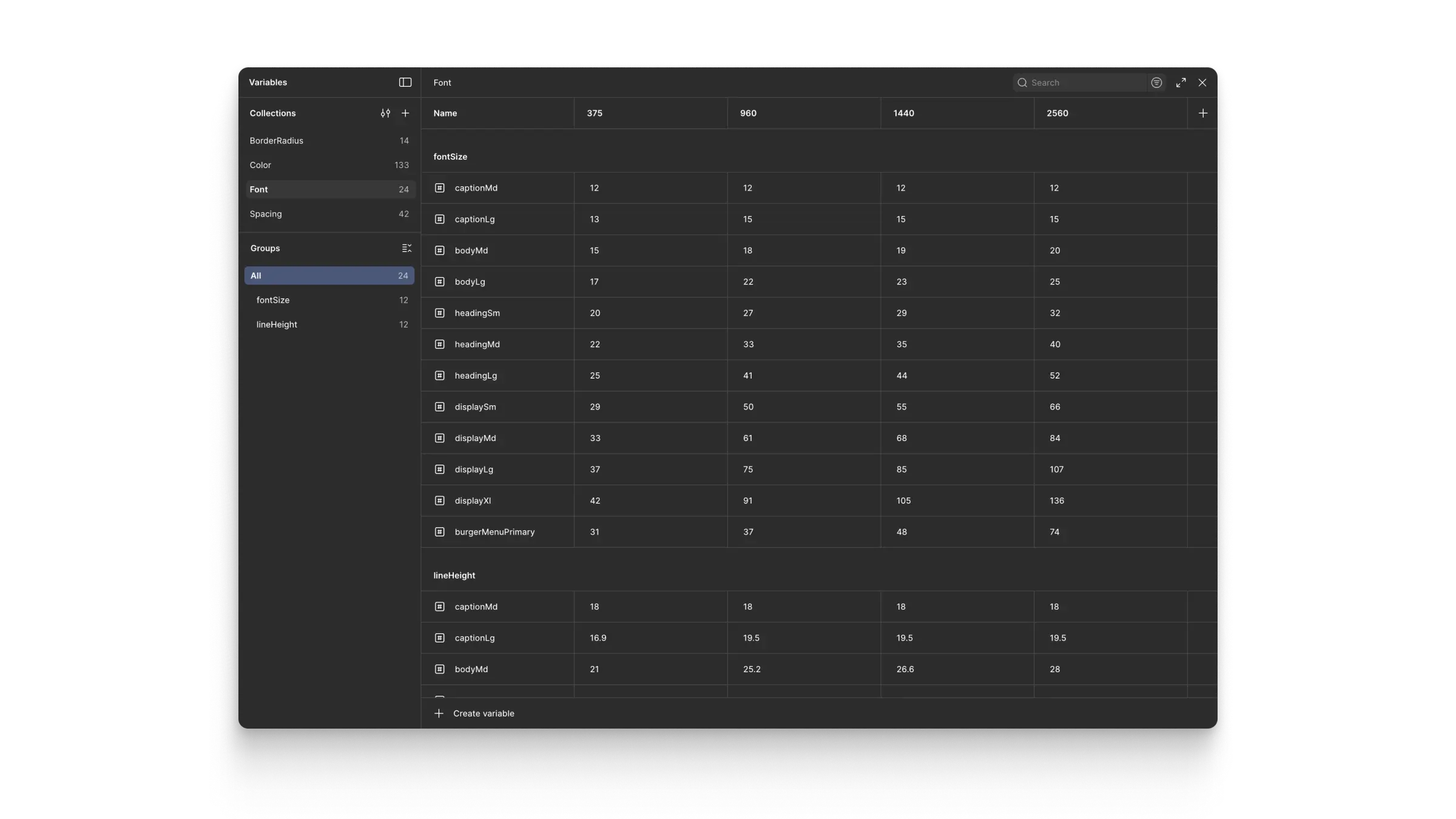
Variable Collections, Variable Modes, and Variables in Figma generated by Token Studio.

Handover file. Used by developers and clients alike. Contains designs in four screenwidths, which is easy to make using Design Tokens and Figma Variables to create responsive components. Notice Pages structure on left to see how I structured the file into Global Elements, Blocks (Umbraco term for content elements), Pages, and Components.

All interface elements are AutoLayout components built from variables and styles that come from Design Tokens.

Snapshot from Components page. This is where developers find common atomically-built UI elements, specs, comments and use cases.
5. Results
Although the site is still under development, the design work has already created several concrete outcomes:
The client now has a clear, scalable content architecture, replacing the previously bloated structure.
Editors gained fewer, more powerful UI components, reducing redundancy and simplifying future training and maintenance.
The new filterable FAQ system has given editors a dedicated home for secondary content, preventing information overload on key pages.
The visual updates established a modernised, coherent brand direction that still aligns fully with HANSENBERG’s existing guidelines.
Development teams received clean, implementable specifications that reduce ambiguity and rework.
The final build will transform how users navigate the site, but the foundations are already firmly in place.
6. Learnings
This project reinforced the importance of thinking from the CMS editor’s perspective as much as the user’s:
Editors need clearly-defined channels for each content type; if they don’t have them, the architecture collapses.
Designing CMS components is a UX discipline in itself—shaping not only the front-end user experience but also the editor workflow.
Good structure can solve as many visual problems as good aesthetics.

