

1. What Niels Brock Is
Website design for Niels Brock, a Danish business college based in Copenhagen. The institution offers vocational education, upper-secondary programs, higher education, MBA courses, and short professional programs, all with strong ties to industry and practice-oriented learning.
2. The Core Challenges
➀ From a UX perspective, the core challenge was agenda congestion. Niels Brock serves several fundamentally different audiences at once: teenagers choosing a business-focused high school, adults seeking short courses, and industry professionals considering leadership education or MBA programs.
On the previous website, editors had no clear way to separate these audiences. All communication lived side by side, all the time, which resulted in broad, unfocused messaging that effectively spoke to no one in particular. While leadership education content might be attractive to some visitors, it risks alienating users who are looking for a secondary education environment — and vice versa.
➁ UI-wise, existing layouts were rigid and uniform, and several accessibility issues needed addressing, primarily related to colour contrast and text sizing.
➂ The project was also challenged organisationally. During the process, the client team was completely replaced, and the new team questioned several decisions that had already been approved. This required re-alignment late in the project and reinforced the importance of clear documentation.
➃ A recurring UX issue was the heavy use of internal abbreviations and shorthand in Niels Brock’s content. While common inside the organisation, this language often made pages harder to understand for external users.
For example, one of Niels Brock’s high schools is located at Julius Thomsens Plads and is commonly referred to internally as “JTP”. This internal naming had carried over into the website, where abbreviations were frequently used without explanation. Over time, this alienated users unfamiliar with the terminology and made navigation and content comprehension more difficult.
➄ A separate challenge was clearly communicating the difference between EUD and EUX programmes. While closely related, the two serve different educational paths and often share similar course structures with important distinctions.
On the previous site, overlapping content made it difficult for users to understand which information applied to which programme, especially when courses were offered in both formats with variations in structure or requirements.
3. My Role
As Lead Designer, I helped refine Niels Brock’s visual expression and elevate the user experience for their latest website, with a focus on structure, accessibility, and clearer audience segmentation.
I worked closely with the client, Niels Brock's editors, and Senior Advisor Carsten Nielsen at Limbo who was in charge of Information Architecture, Content Mapping, and Wireframing for this project.
4. Approach
4a. Segmenting Visitors Early
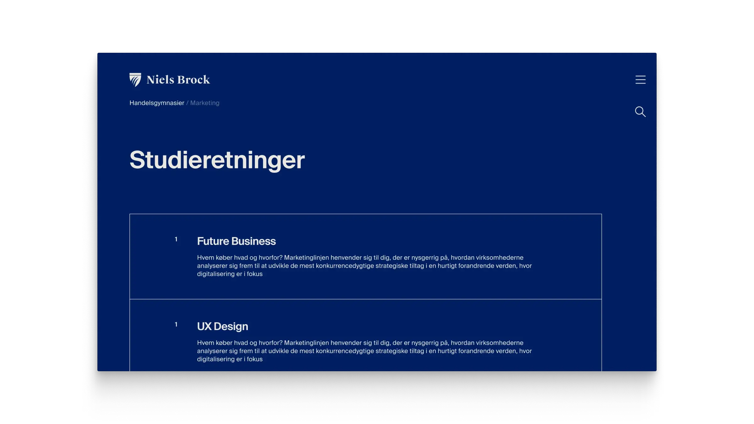
A central design decision was to segment visitors early. The front page was redesigned as a funnel, guiding users into distinct sub-front pages aligned with Niels Brock’s primary educational tracks. Previously, all content lived on a single unified front page.
Early Proof of Concept for scroll triggered Funnel page segmenting visitors into relevant channels. Animated in AfterEffects.
4b. Typographic labels for clarity and content differentiation
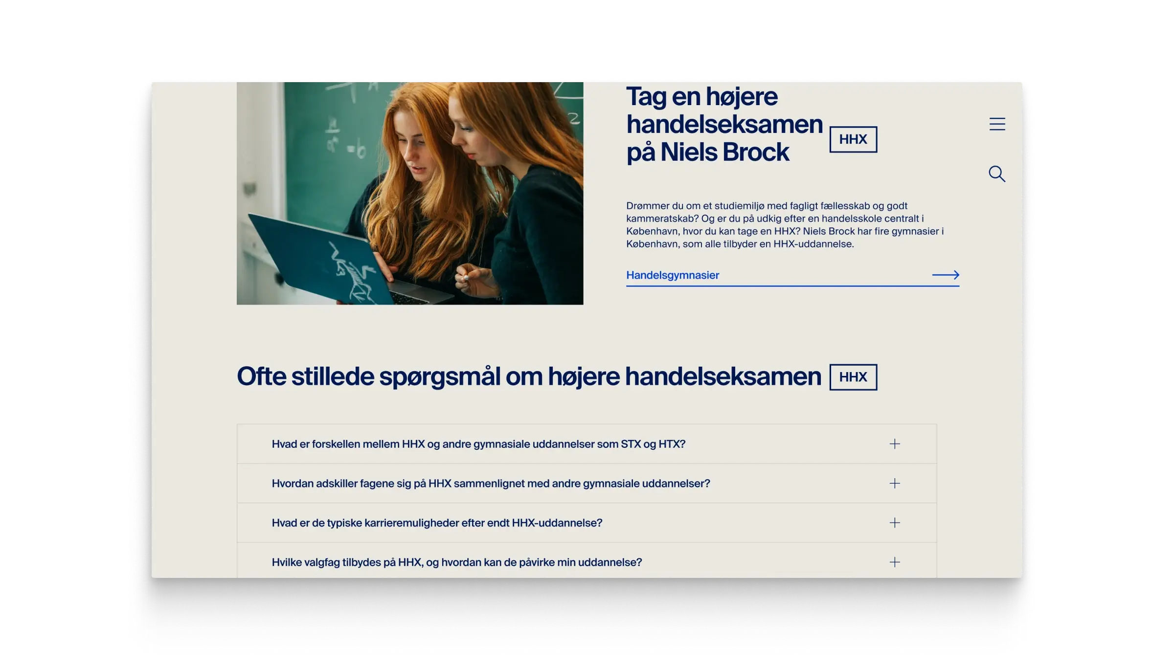
I designed a typographic label system that can be embedded within text to indicate commonly used abbreviations or shorthand. Editors continue to write full names in the main copy, while the labels provide a subtle, consistent reference to internal terms.
Beyond clarifying abbreviations, the labels also help differentiate content for similar educational programs, such as EUD and EUX, making it easier for users to understand which information applies to each track. This approach integrates seamlessly into the existing editorial workflow and requires minimal training for content teams.

Typographic labels visible in the page title.
4c. Expressive Layouts
Visually, we explored a more expressive grid with offset elements and a fragmented rhythm. In practice, these layouts proved too dependent on tightly curated content and were later simplified. The final solution established clearer rhythm and consistency, making it more robust in production.
Working with motion and microinteractions. Here's the generic Page Transition for the project.
Simple typographically driven Overview Page.

Search Page.
4d. Using Design Token Boilerplate to Accelerate Design Process
From a systems perspective, I worked from a reusable design-token boilerplate that allowed me to generate a full variable system quickly. Typography, colour, spacing, and radii were all driven by Figma Variables mapped to Token Studio. Because fluid typography wasn’t practical in Figma at the time, I used Variable Modes to represent the exact breakpoints we were designing for. This allowed components to adapt automatically when moved between mobile, tablet, and desktop frames, meaning each component only had to be built once.
The entire design file was fully systemised:
Text styles, spacing, and radii were variable-driven
Layouts were built with Auto Layout
Reusable UI was componentised
Figma Variables mirrored Token Studio values used by developers

Design Tokens created and maintained in Token Studio (Figma Plugin and more). Token storage is located in GitHub and available for developers in their platform specific units and variables.
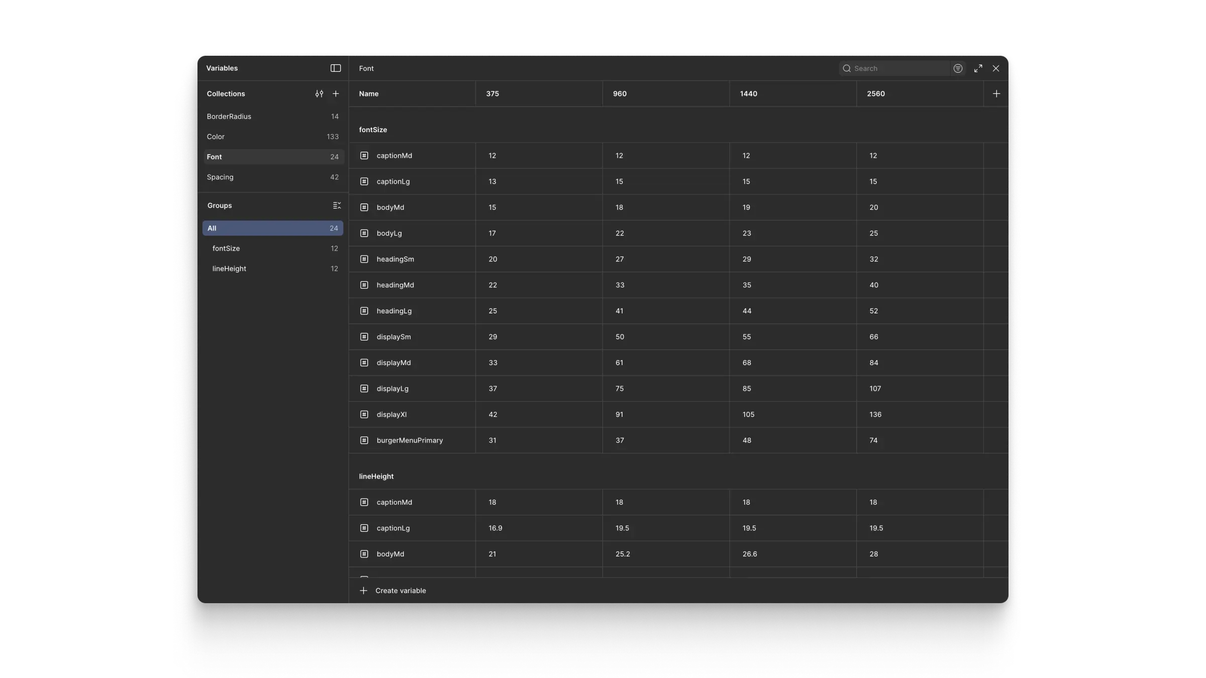
Variable Collections, Variable Modes, and Variables in Figma generated by Token Studio.
4e. Helping Editors Understand Funnel Approach
To support editors, we provided page layout templates with populated example pages. This helped demonstrate how focused content could live comfortably within each channel, without constant cross-referencing that would confuse visitors.
5. Results
The new structure successfully segmented visitors into clear channels, allowing communication to be more focused and relevant within each educational track.
The typographic label system significantly improved content clarity and user comprehension. New users could easily understand abbreviations without losing context, while editors retained the flexibility to use familiar internal shorthand. Additionally, it helped clearly distinguish similar educational programs, such as EUD and EUX, reducing confusion and supporting more precise navigation and content consumption across the site.
The initial complex layouts were intentionally abandoned when they proved too fragile in real-world editorial use. The resulting layout system was simpler, more consistent, and easier to maintain in production.
6. Learnings
This project reinforced the value of restraint. While systems and tooling enable speed and consistency, not every interface benefits from visual complexity. Simpler layouts often perform better when content cannot be tightly curated.
It also highlighted the importance of documenting decisions and approvals. Client teams can change, and clear documentation is essential for maintaining continuity and protecting design rationale.

